

How to Fix the Secret Habit That’s Costly to Your Email List
“I have tried something like this before, but I have always failed.”
That is the sentence I hear most from people trying to build an email list that actually grows. They put together a free guide, build a page, send some traffic to it, and watch almost nobody sign up.
The easy assumption is that the offer was wrong, or the traffic was wrong, or this whole thing simply does not work for them.
Usually none of that is true.
Email list growth rarely stalls because of a bad idea. It stalls because the page asking for the email address is quietly working against itself, long before anyone reads a single word of the offer.
The Habit Nobody Warns You About
I have coached online business owners for more than two decades, and reviewed hundreds of sign-up pages over the years, my own and pages belonging to people I have coached. I keep finding the same habit.
A page starts out simple. Then, bit by bit, someone adds a social icon here, a second offer there, a menu bar left switched on because nobody got round to removing it.
Each addition feels harmless by itself. Together, they turn one clear decision into four or five competing ones.
A visitor who only has one decision left to make signs up far more often than one who has to choose between several.
That is the whole mechanism. Not a weak offer. Not the wrong audience. Just too many doors standing between a visitor and the one you actually want them to walk through.
Why More Choices Rarely Means More Sign-Ups
Most visitors arrive with one problem already on their mind. They want to know if this page is going to solve it. This single habit quietly blocks email list growth more often than a weak offer ever could.
Hand them a learn more button, a second product, and a row of social links at the same moment, and that one clear question splits into several quieter ones. Is this page even for me? Should I look at that other thing first? Do I need to scroll further before I decide?
Faced with that much to work out, most people choose the easiest option available. They close the tab.
I have spent decades watching something similar play out with people, just in a different setting. Partway into my medical career I realized the job was never really about the diagnosis. It was about finding out what the person in front of me actually wanted, and where they were stuck.
“Understand your customer, find out what he wants, figure out where he is stuck, and get to the unsticking of him,” is how I put it. A cluttered sign-up page does the opposite. It leaves a visitor stuck between five choices instead of helping them take the one step they came for.
What’s Going On? and Why It Matters Here
I am direct about what I think the market gets wrong. I believe too many business owners guess what their customer wants instead of simply asking, What’s Going On?
A busy sign-up page is a guess dressed up as a design choice. It assumes a visitor wants five options instead of finding out they really only wanted one thing, clearly offered.
The fix does not require new copy, a new offer, or more traffic. It requires removing everything competing with the one action the page exists for.
The Five-Minute Fix
Open your own sign-up page right now. Count every clickable thing on it: buttons, icons, menu items, extra links.
Ask one honest question about each: does this help a visitor sign up, or does it just give them a reason to leave instead?
Anything that fails that test gets removed, or pushed well below the main button. One headline. One short line of benefit. One email box. One button doing the one job it exists to do.
Once the clutter is gone, tell the visitor plainly what happens next. A line as simple as “you will get this by email in the next few minutes, and nothing else” quietly answers the fear most people never say out loud. That fear is simple: signing up means being buried in offers.
This is also where the right tool earns its keep. I run my own list and welcome sequence through eShowcase, which sends that confirmation the moment somebody signs up, without me having to touch it. Whatever you use, the point is the same: the promise you make on the page should be kept automatically, not remembered manually.
I have written a bit about related ideas in other articles I have shared recently, if you want to look at how this connects to the rest of your list-building setup.
Give It a Real Week
Run this check once, then leave the page alone for seven days before judging it.
Most people notice a difference by day three. Nothing about the offer changed. The visitor simply stopped having to think their way past everything standing in front of it.
You do not need a bigger list for email list growth. You need the list you already have access to, and a page that finally gets out of its own way.
Pick one page today. Count the choices. Remove what does not earn its place. Then watch what happens to the numbers you already have.
All the best,
Jon
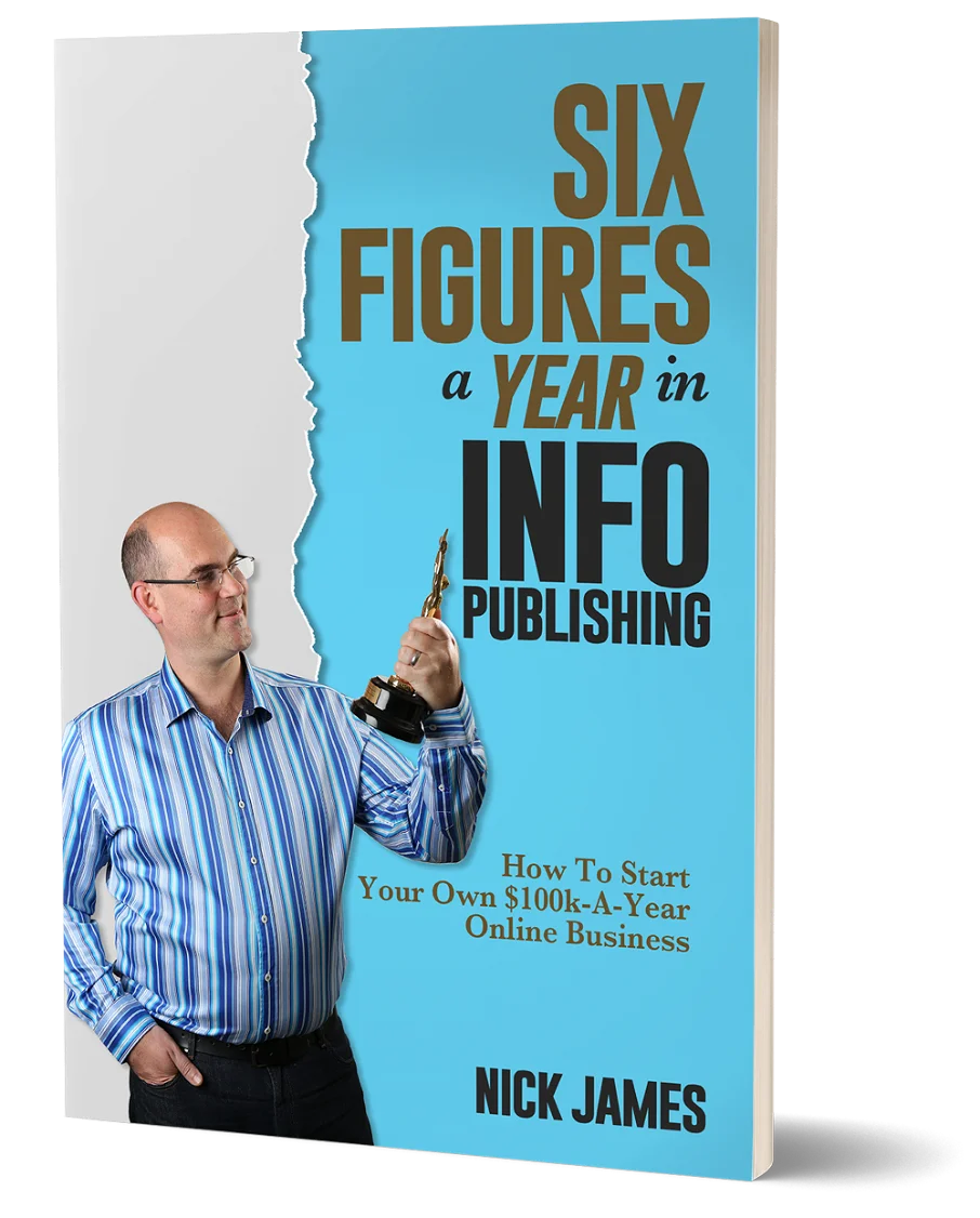
Author offers a FREE copy of this book to his next door neighbor... to prove he's not a drug dealer!
Now claim your FREE COPY.
and follow the step-by-step instructions for making the kind of money (and living the kind of lifestyle) that'll get your neighbors curtains twitching with curiosity!
Enter your details below to discover how to claim your FREE COPY of 'Six Figures A Year In Info Publishing' ...
Privacy Policy : We value your privacy. You can unsubscribe from receiving future emails with 1 click at any time.